MY FIRST EVER WEDDING ASSIGNMENT // CRITIQUE & PRAISE
Nani Annette challenged me and a few others to do a blog post where I’d give critique to my past self and maybe some praise as well. After digging through my closets for a while, I finally found what I was looking for; the first wedding set I ever photographed. It was 2008 and I was such a blue-eyed beginner. This might get interesting! Everyone who knows me knows that when it comes to my work, I’m hard to myself. So many times I see what I could have done differently instead of things I did right. Unfortunately I couldn’t find RAW files so I can’t show you what I’d do with the files now.
All these photos are taken with Nikon D300 + Nikkor 50mm/F1.8 + Tokina 12-24mm/F4 + probably Nikkor 55-200mm f/4-5.6G.
Prepare yourself, it’s going to be a bumpy ride!
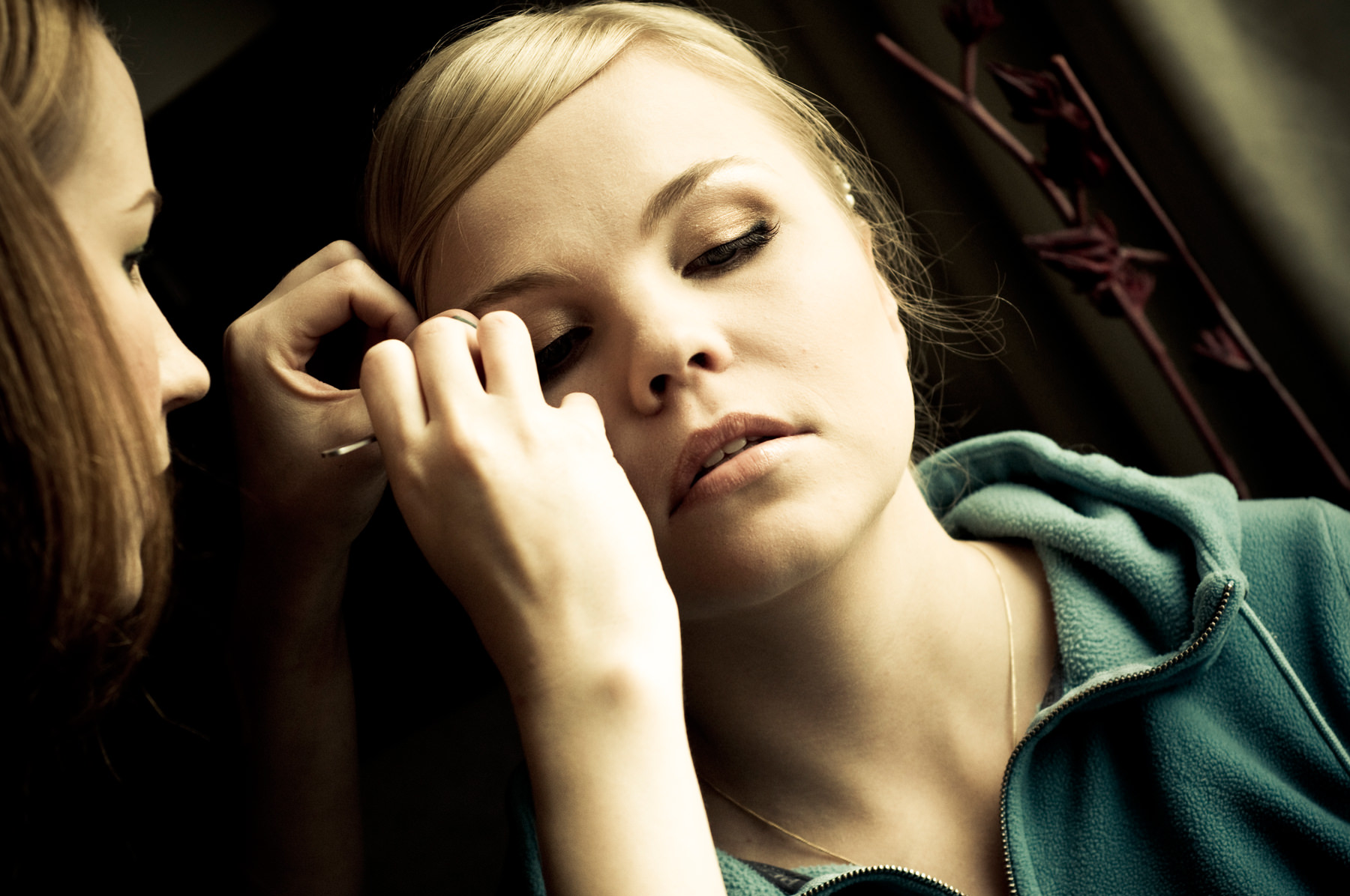
Oh my gosh… what should I say? When you’re just starting out, you want to be different no matter what. I would not tilt this much nowadays. I value symmetry and straight horizon so much more these days. As tilting is used to make viewers feel uneasy I think it’s the exact reason why this makes me feel a bit uncomfortable. I wish I could just grab this image and force it straight! I would probably step back and leave more negative space around my subjects or maybe even go closer. I kind of like this crop as well, maybe partly because I have never really followed the “rules of photography”. I know them, I value them, I sometimes use them but we’re not married. I’d edit this photo in a much more different way because I value more natural color palette these days. All this golden/yellow/blueish thing is not speaking to me anymore. In some ways it has too much contrast and I’d also bring down highlights a bit. But the more I look at this photo, the more I can recognize myself in it. It’s a small moment during a wedding day, but a strong moment in a way. And I love photographing moments like those.
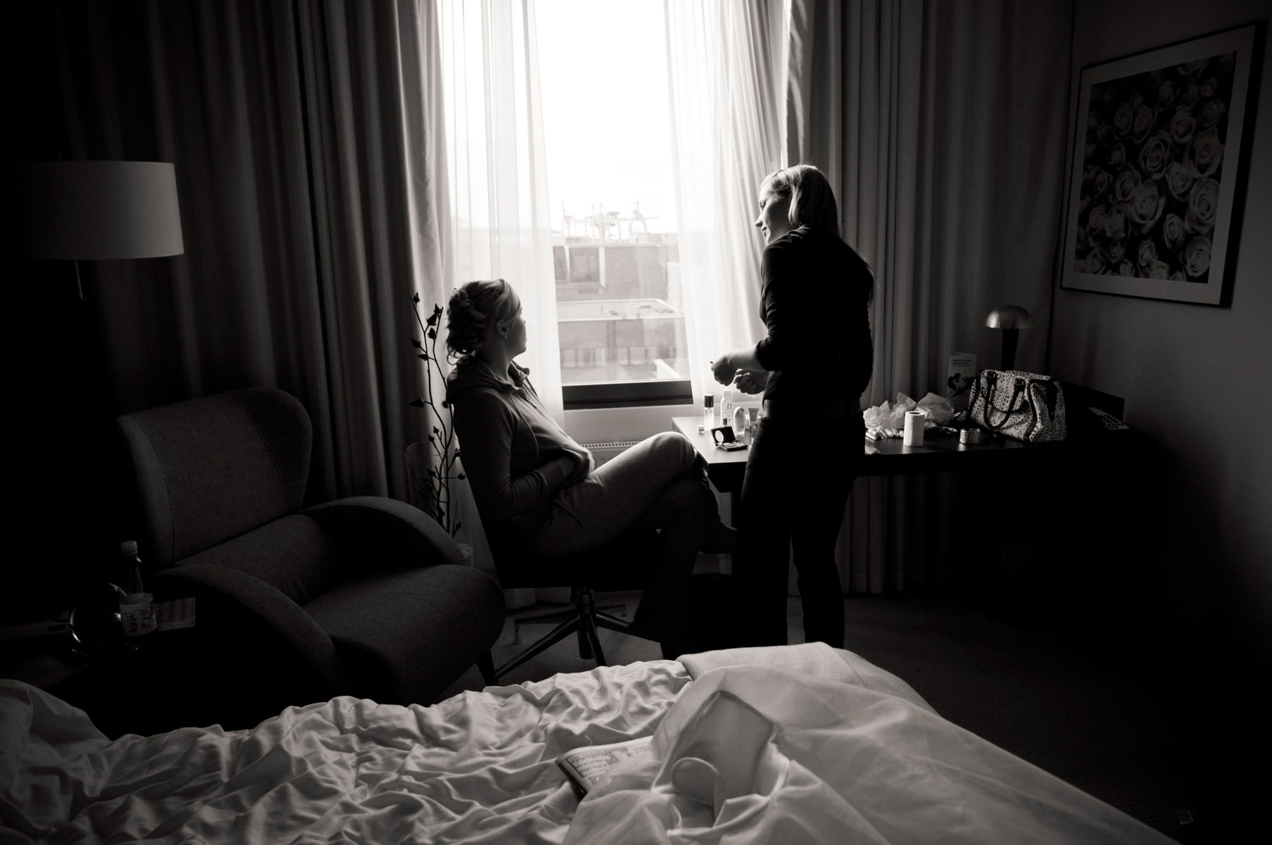
This (with a few alterations) could actually be featured in my current sets. Just like with the previous photo, I would straighten my angle a bit and back up a few steps, maybe move a bit to my right so that the window would be in the center of the image, creating lines and symmetry. Maybe I’d wait for a moment with a bit more action or where Elina would look at Mari. I don’t like this BW conversion at all, it’s too flat. Overall I can see myself and my style in this because I love documenting small passing moments, mood setters. I also like light and shadows.
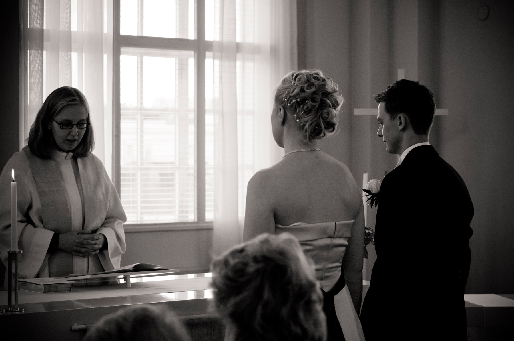
Clearly I’ve trusted in tilting with this set because it was hard to find straight photos (you can see more of them here), but here’s one. I give myself credit for moving away from the altar and searching for different angles. I like that you can see the priest as well. I’d move my camera a bit more to left so that there would be a bit more space to my left. I would have edited that strap away, reduced noise and bumped up exposure a bit. Maybe I could have also expose this photo correctly while taking it! Same comments on BW conversion, it’s missing a lot.
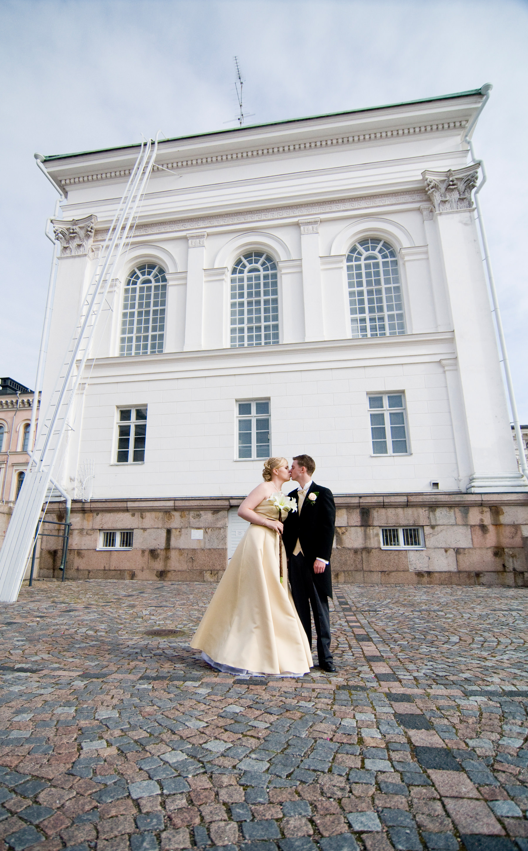
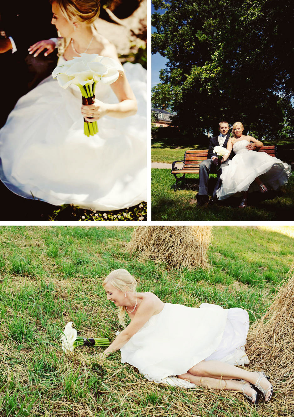
This is really basic one (kiss now!) but I give myself credit for not tilting the darn picture! I would not use a lens this wide anymore or at least I’d correct some of the distortions. I’d tell Elina to hang her bouquet to her side in a relaxed way and ask Philip to put his hand in his pocket or move closer to Elina and touch her waist or face. I’d also move them to the center of the building and move myself with them so that there would be more symmetry.
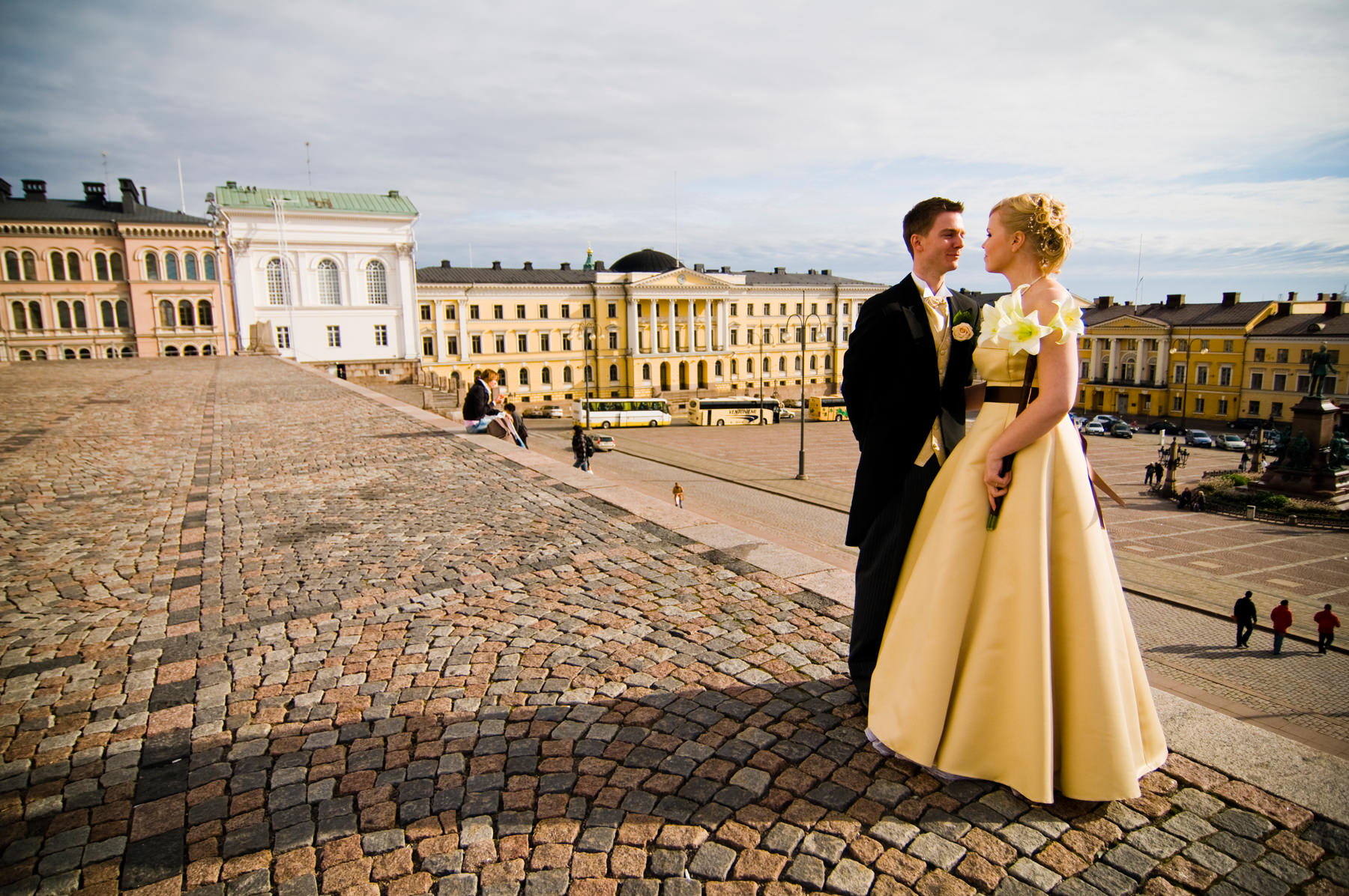
The one thing I’m finding hard to overlook is the way I’ve edited these photos. There’s so many different presets I’ve used. There’s neutral, yellowish, warm, cold and whatnot. If I could start my time machine and head back to 2008, I’d tell myself to pick one color preset and one BW preset and stick to them. That way this set would be more coherent. Like in the previous photo, I’d tell them to move closer. I like the overall feeling of this photo, it’s simple and shows not only the couple but settings as well. I can see a start of something here.
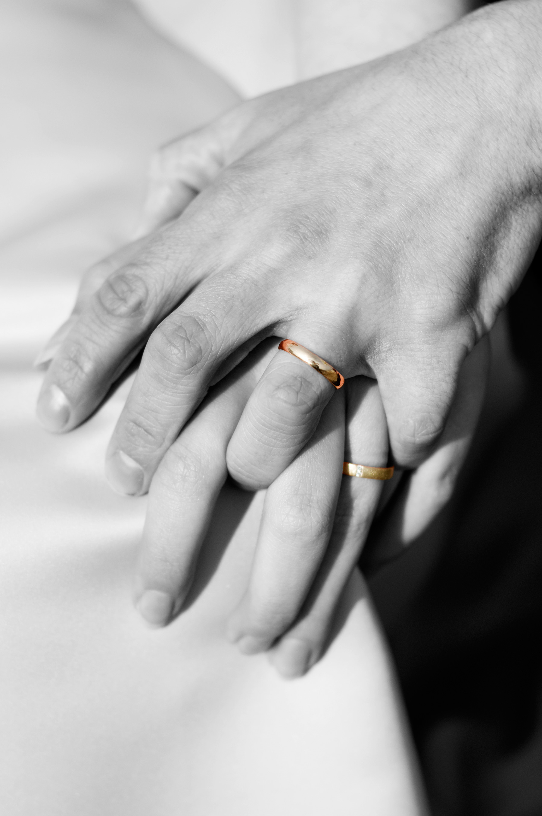
And now it’s time for the NO NO NO NO NO part of this set. Selective color. It’s a curse word in photography circles, at least in those I’m involved with. So NO. No, Johanna. And once more no. It’s such a cliche and not me at all. Also, the diffuse glow? No. Maybe I could have used a smaller aperture to show both of their rings because now Elina’s ring is blurry. Or at least I could have taken another shot to go with this “artsy” shot.
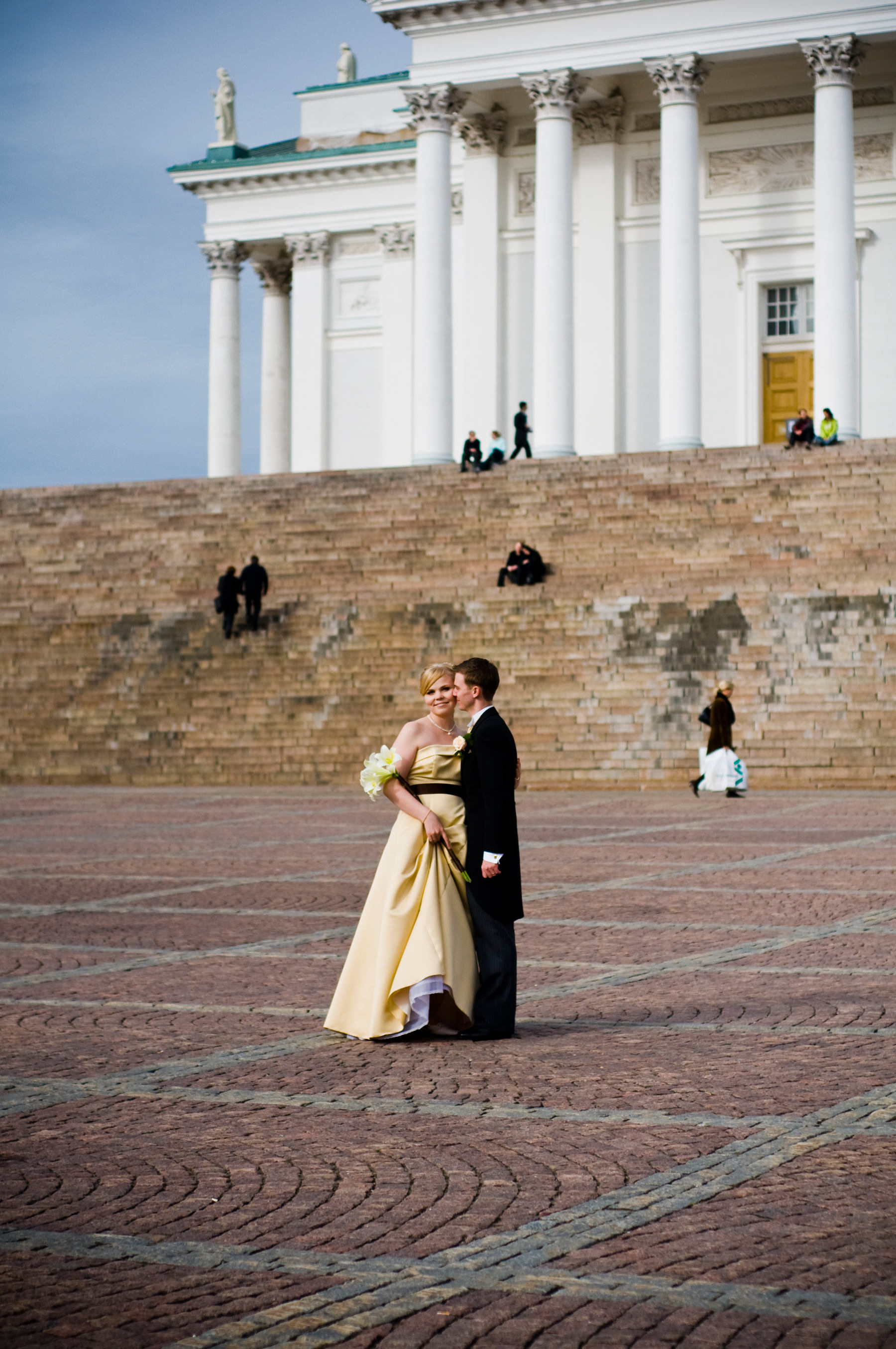
In this photo I can see a lot of myself. It’s the starting point to where I am now. What I’d change; ask Philip to put his hand in his pocket and move all of his weight to his right foot. Maybe Elina could look either to her side/downwards or look at Philip. Editing is not what I’d do nowadays but it’s not that bad. I’d remove vignetting. Overall I like this photo a lot with all the blurry people behind them and everything. WAY TO GO, JO!
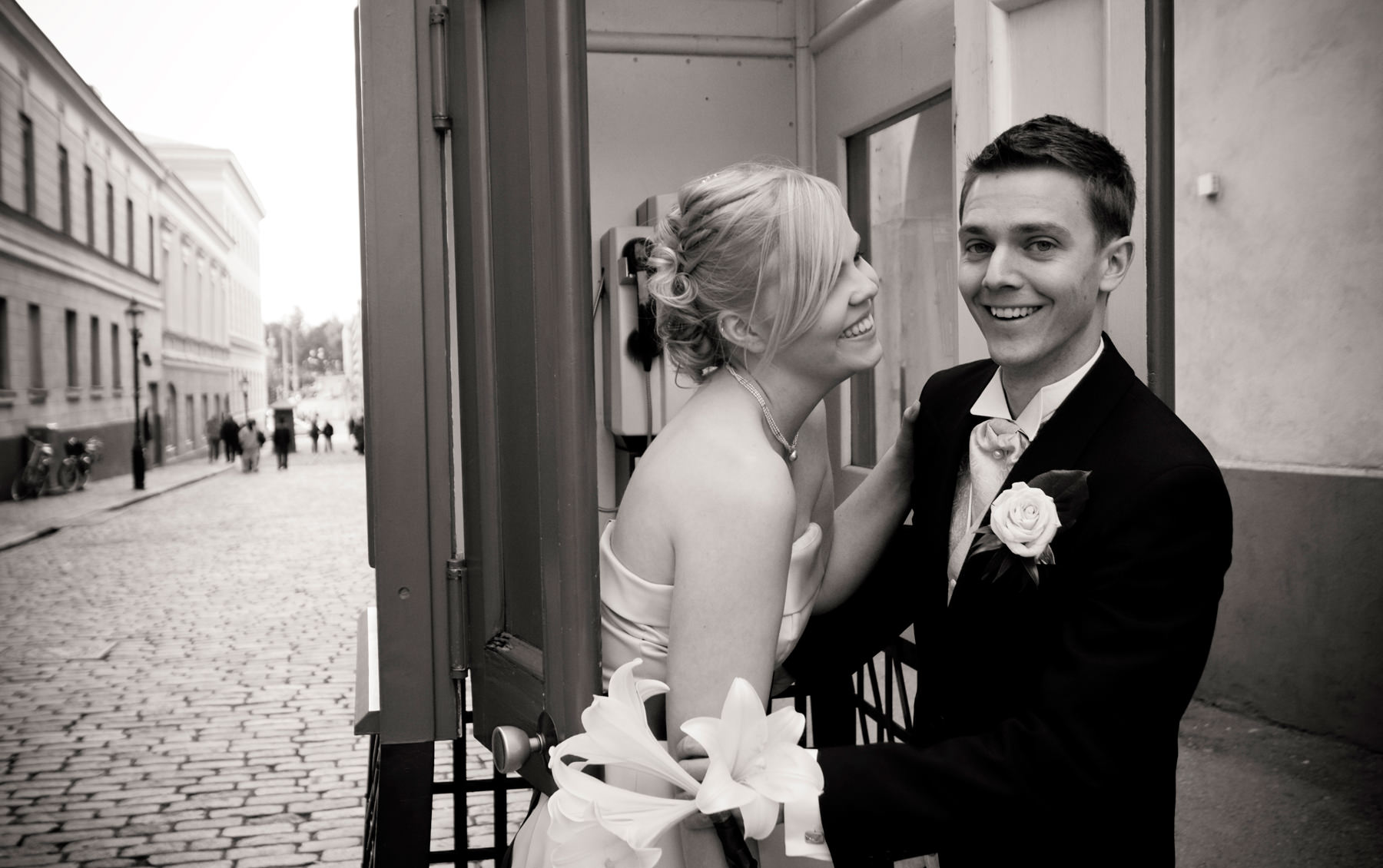
This is one of my favorites as well. It’s not a super posed photo, it has emotion going on and some idea. It makes me think what is going on, especially since I can’t remember what happened! The same thoughts on BW conversion. I’d also straighten this photo a bit, remove vignetting and bring some light to Philip’s face.
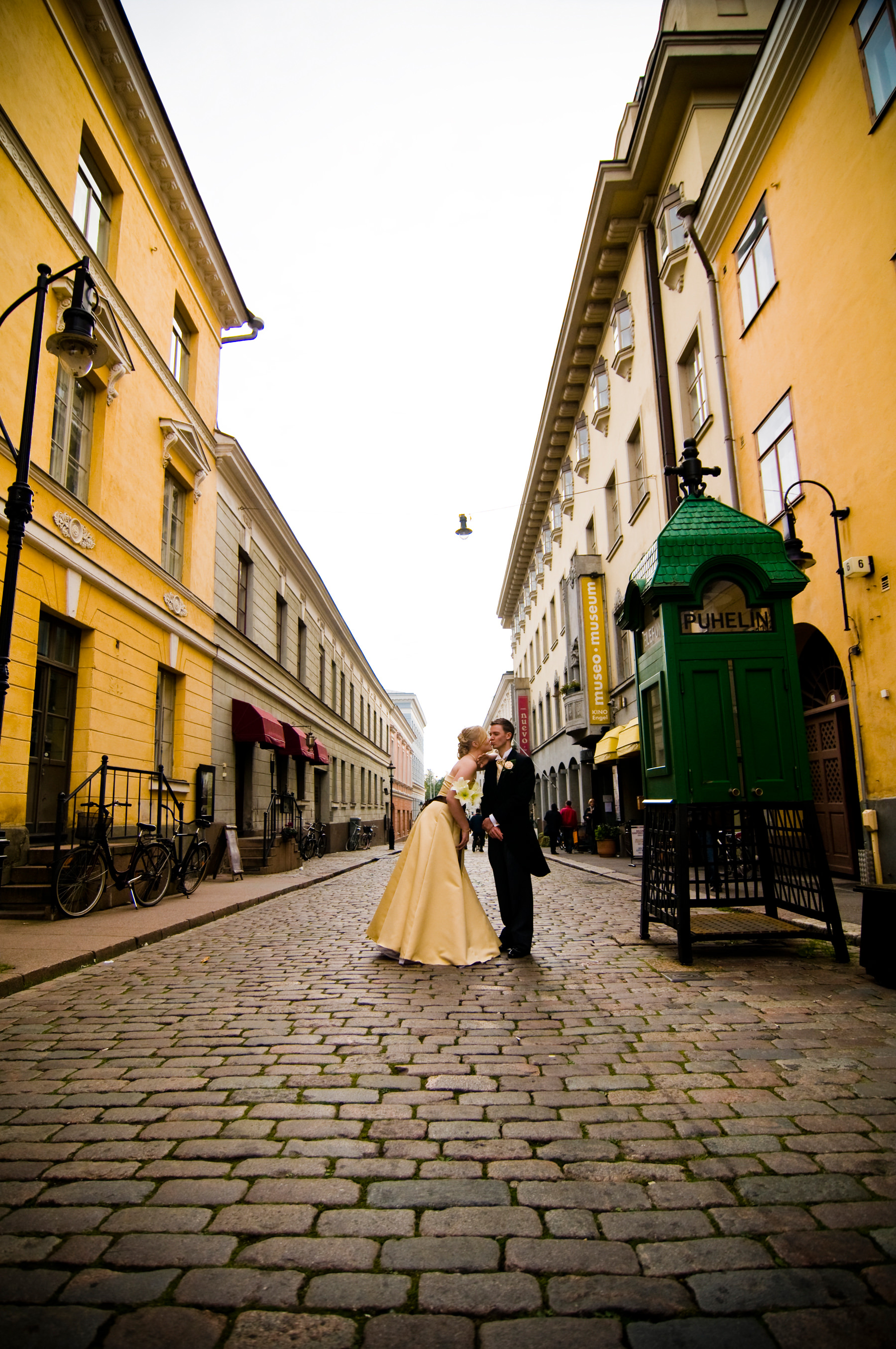
Although this might be a little cliche with all that kissing going on, I still dig it. I like that I’ve been thinking surrounding settings as well. I’d probably position myself in the middle of the street so that Elina & Philip would be in the middle of the buildings. I’d straighten this photo and remove chromatic aberration. I’d underexpose this shot a bit so that I could avoid overexposing the sky.
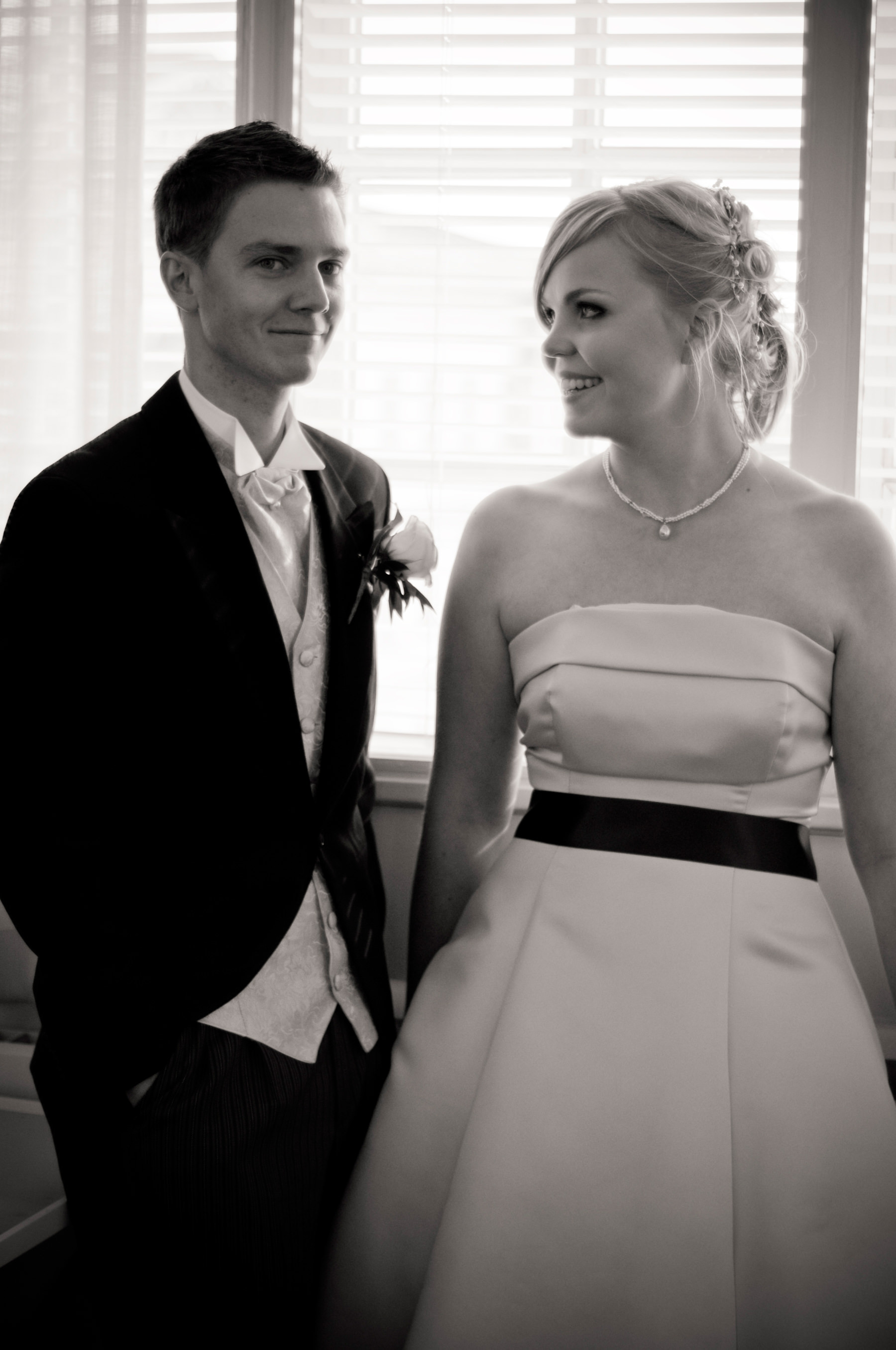
Although I haven’t quite nailed focus in this photo, I like the overall feeling and the natural expressions. It’s also underexposed a bit, something I could have corrected while editing. I would have placed them differently but I think that could have ruined the natural vibe that’s going on in here. And the editing… not going to say it again! Clearly this “missed focus/sharp focus” roller coaster has been giving me a wild ride throughout the years because I’ve had periods when I hated everything that was not perfectly sharp. But nowadays I think that feelings win when it comes to missed focus.
So, what have I learned?
Overall I’m still super happy and proud of myself. I was afraid and super nervous but still I was able to take lots of versatile photos. It was my first wedding and I didn’t ruin everything! I’m so, so, so thankful that these two gave me chance; who knows where I’d be without them! When it comes to editing, photographer’s these days have it so easy with VSCO, Red Leaf & Mastin Labs offering so many awesome presets to choose from. When I was starting out, all I have were some presets I found after googling and going through many worse options. It’s so easy nowadays to make your photos look better and your sets coherent! These days my editing is based on how I see the photograph in my head when I’m taking it, how it looks like when it’s printed on my favorite fine art paper. I’m also trying to make all photos I deliver to stand the test of time. Right now “filmy” look is “in” and yes, we can have debates whether if that is something that is thought as the trend of 2010’s in the future. But just like with everything, you need to follow your vision. The turning point for me was when I joined Starting a Wedding Photography Business group in Flickr (now it’s Succeeding!). It made me think of a lot of things. I learned that wedding photography doesn’t have to be the cliche that I though it was when just starting out. It made me realize I don’t want to just take photos. I want to be in the moment, tell stories. I have a vision and I’m happy I found it thanks to a lot of awesome people and by learning to listen to my heart. I’m forever grateful I have the chance to do this for a living.
// Johanna

I’m really liking the images